Problem Statement
Mechanics and automotive professionals often face challenges in keeping up with the latest techniques, technologies, and regulations in their field. This can lead to reduced efficiency and potentially even safety issues. Traditional training options, such as in-person seminars or lengthy online courses, are not always convenient or cost-effective.
My Contribution
I was the one-woman army product designer for this project. I identified the problem, user personas, user research / testing, UI design, UX design, and facilitated the design hand-off to developers.
Solution
Our app aims to address this problem by offering microlearning courses that provide mechanics with the knowledge and skills they need to stay current in their profession. Through high-definition video classes that can be accessed anytime, anywhere, mechanics can learn at their own pace and on their own schedule. In addition, our app offers a variety of diagnostic tools and equipment, as well as after-sales services and technical support, to help mechanics succeed in their work. By providing a one-stop solution for automotive professionals, our app aims to improve efficiency, safety, and overall success in the industry.
Objectives & Goals
Objectives:
- To provide a convenient and cost-effective solution for mechanics and automotive professionals to stay up-to-date with the latest techniques and technologies in their field.
- To offer a variety of microlearning courses, covering a wide range of topics, that are accessible anytime, anywhere.
- To provide mechanics with the tools and equipment they need to perform their work effectively.
- To offer after-sales services and technical support to help mechanics succeed in their work.
My Design Process

Context
The application was first launched in 2021 for Android users and was recently updated for iOs, adding basic details to the design without changing the information architecture and user flow. However, it is planned to refresh the application and its content for 2023 with the following requirements.
Stakeholder requirements:
Analysis of the current app:
- Lack of hierarchy in the information structure.
- False affordance, when showing active sections that are not yet available.
- The navigation of the App limits the flexibility and efficiency of use.
- Inconsistencies in the design system.
- Interface design without Grid alignment.
- Proximity in buttons generate errors of use.
- Inconsistencies in the application of color styles.
App Functions (The user will be able to):
- Access training courses.
- Submit technical support requests.
- Purchase products.
- Manage their user profile


Important Feedback
A survey was conducted on 25 of some of our returning customers to quickly ask what to add or remove from our app based on their experience. The purpose of this was to uncover potential quick wins on simple improvements that could be executed quickly. A look at the answers:
Positive experiences
26% of users reported having a positive experience with the app, saying that it was easy to use and helped them diagnose and fix problems with vehicles efficiently.
Neutral experiences
34% of users reported having a neutral experience with the app, saying that it was okay, but could use some improvement in certain areas such as information hierarchy and design consistency.
Negative experiences
60% of users reported having a negative experience with the app, saying that it was difficult to use due to false affordance, inconsistent design, and confusing navigation.
Stakeholder requirements:
Competitor Analysis:
An analysis of competitors was performed to determine their strengths and weaknesses, and to guide the development of the EAATA App's functionality and information organization.

Benchmark
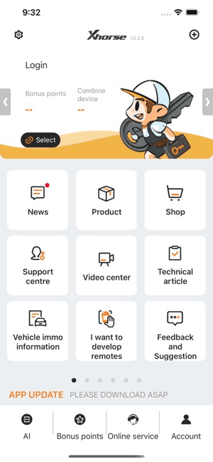
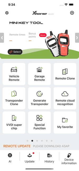
Xhorse App
Target User
The application will be created for people interested in the automotive sector, to improve their skills, through tools, knowledge, and keep them updated with new automotive technologies. Users will be in the age range of 25-65 years approximately.
96.4%
Male
Using a database of 30 million profiles Zippia estimates demographics and statistics for automotive technicians in US
User Persona:
A persona was built based on the data collected to help drive decision making and keep the product focused on solving users pain points, frustrations, and goals.

Content Map:
Now we'll create the content map, which provides an overview of the content we need in our app, to cover more information later, serves as a roadmap for creating and organizing content in a product, and helps ensure that the product final meets the needs and expectations of the target audience.

User Flow:
For the development of the user flowchart it was crucial to understand the information provided by the automated database that would be associated with the app and would load user data and subscription types, as well as group the types of services according to their functions.


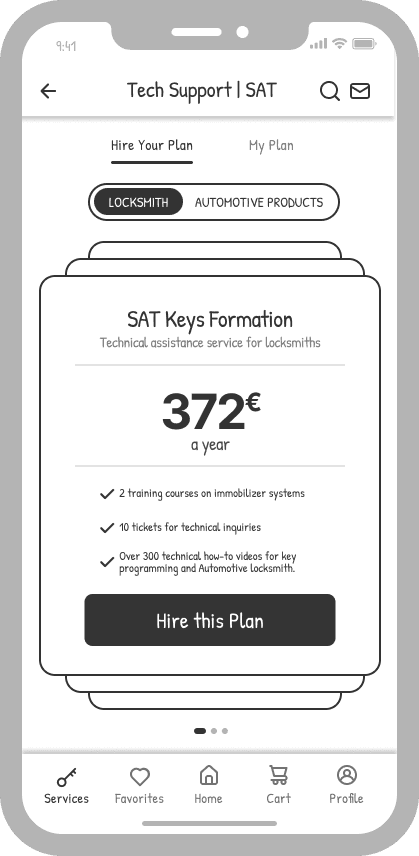


Medium-Fidelity Prototype
The development of wireframes focused on the creation of frames are related to technical support services, technical service, home and the assistance bar.
Below is a sample of a low-fidelity visual representation of the layout and functionality of the app. It shows the structure of the screen, and the placement of elements such as text, images, buttons, pop-ups, forms, etc.
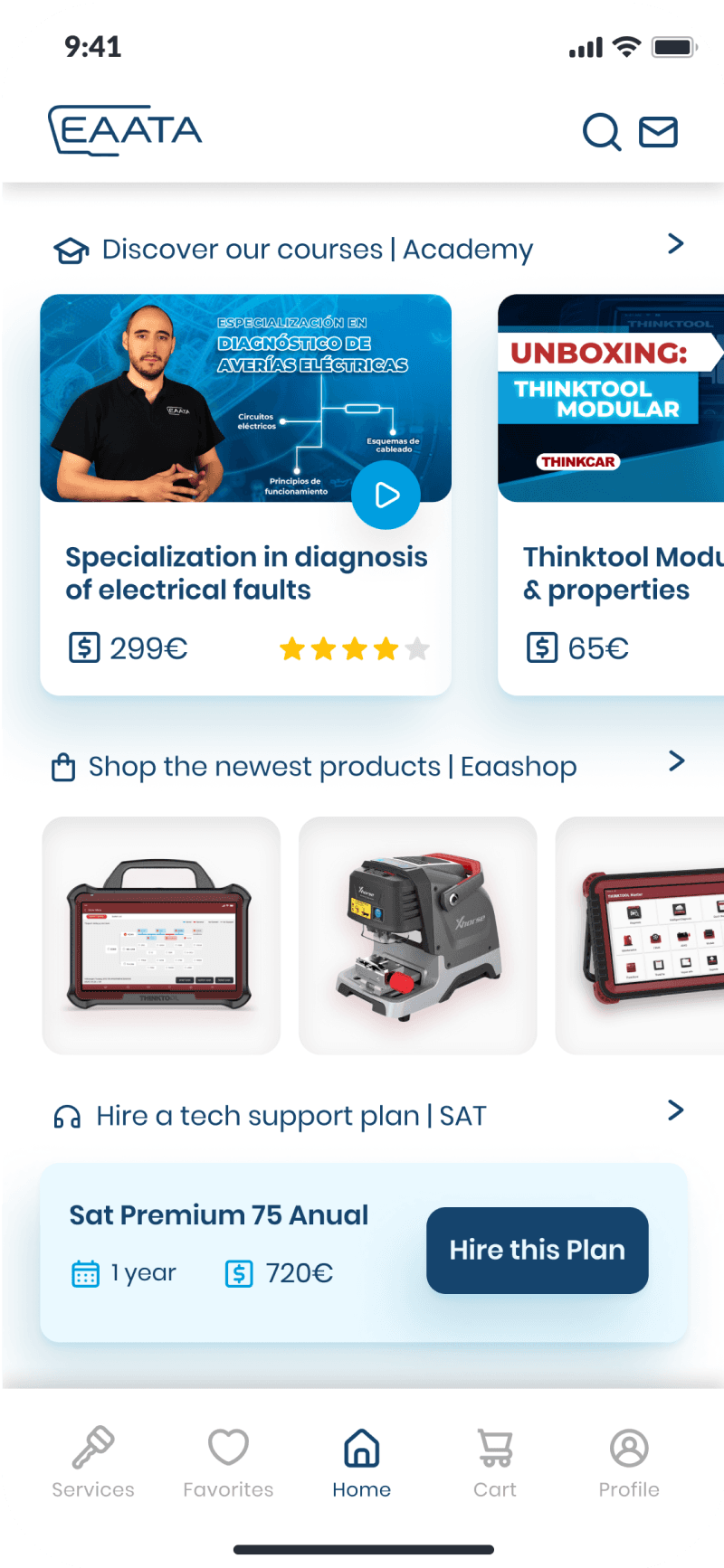
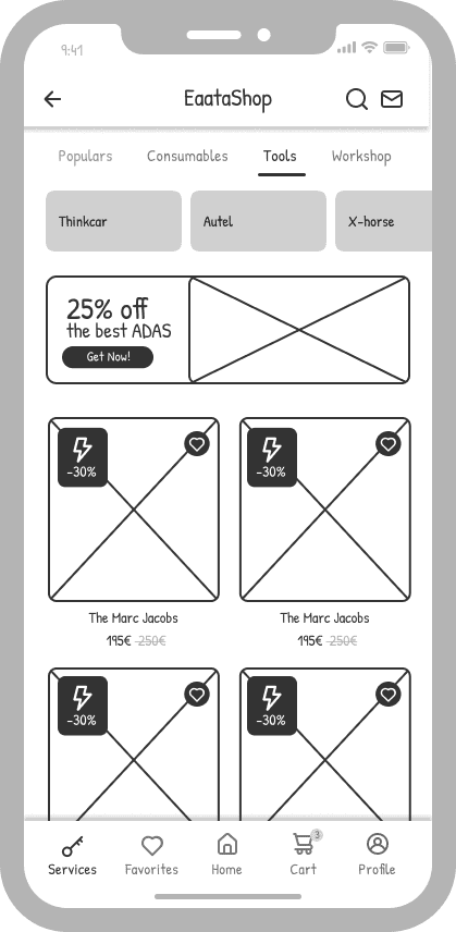
Home Screen:
The home page is one of the main changes made, since it proposes:
✔ Top bar with a general and immediate search where the user can search for the service they need. It will also have immediate access to notifications.
✔ Nav bar (bottom), which identifies the user and allows immediate access to their profile. This bar will work permanently to give the user immediate access and a better browsing experience within the app.
✔ A summary that updates the user on ongoing services, products, or associated equipment.
✔ Services menu, in this section the user according to his needs can start browsing in the selected service.
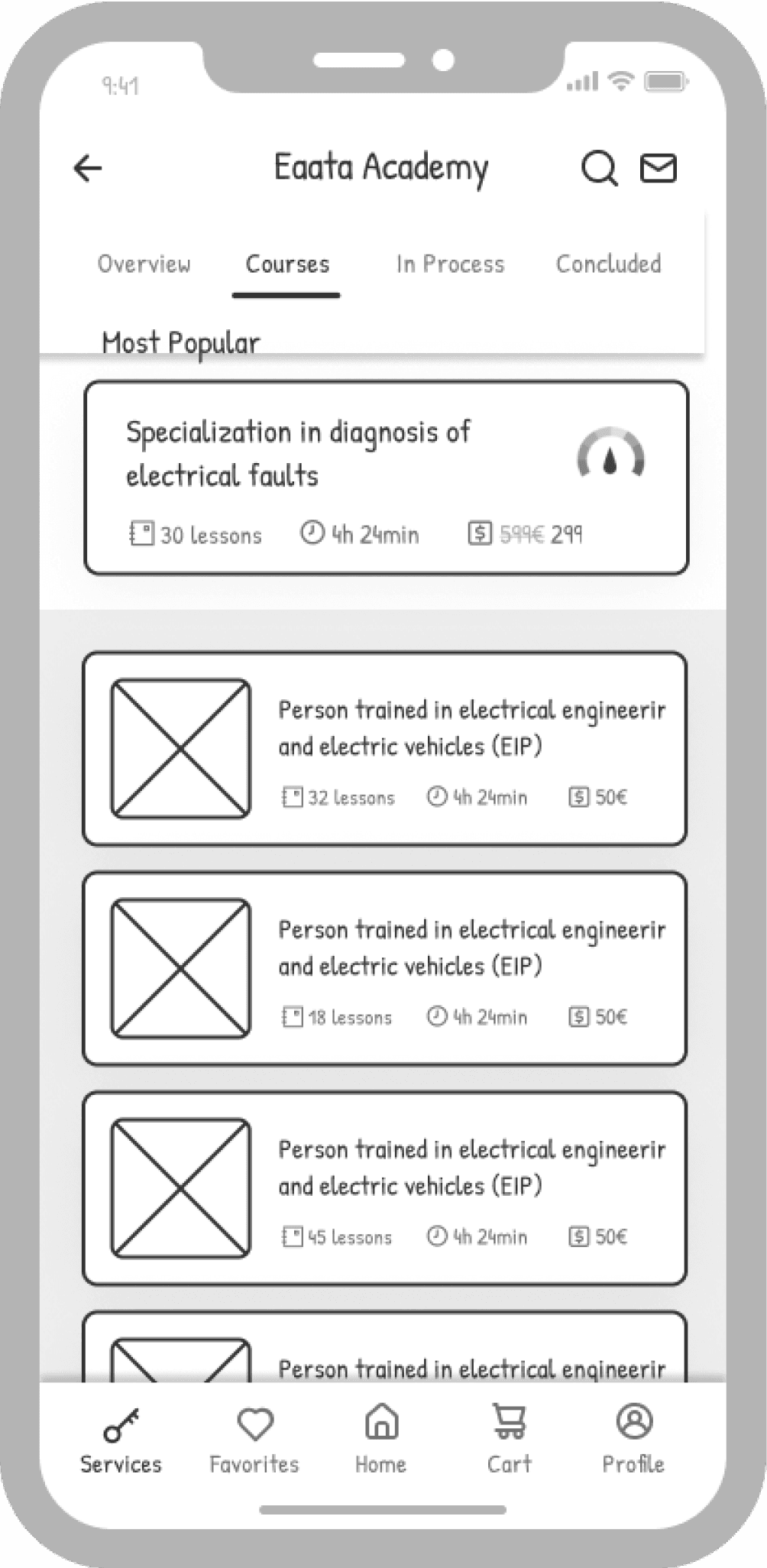
The organization of the screens related to the courses, technical support service and machines are focused on facilitating the recurring actions of the users and the navigation between services, for this reason the following actions were implemented:
✔ The Nav bar (bottom), is transformed to give space to access home and profile on any of the service screens, allowing flexibility of navigation and error correction.
✔ Tabs that allow the user to navigate between the available states of the ements (this case courses) without having to return to home again. This is decided since the user in a session can make use of multiple actions, which allows freedom and control of navigation.
The aspect mentioned above is consistent in the rest (services) of the app as it helps to make the application easier to use and more intuitive

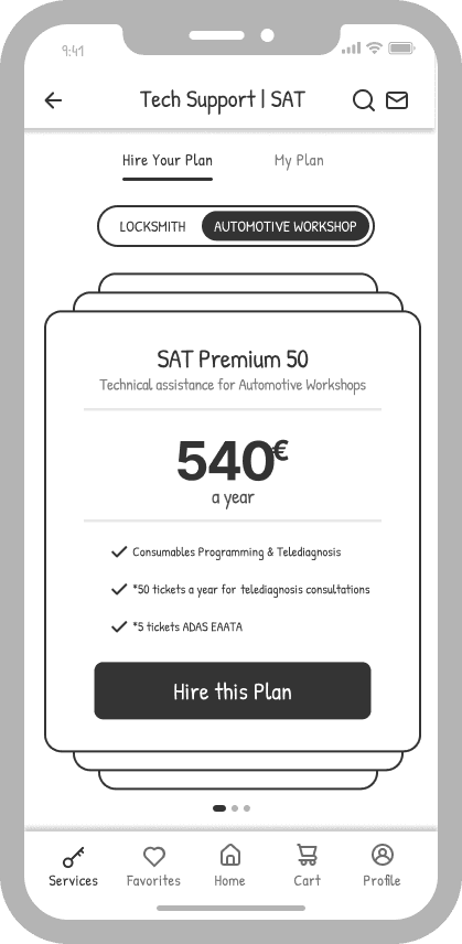
The client was very strict with his visual identity, as he requested that only his blue color palette be used in the designs. Using the 60-30-10 rule, my goal was to make the app as simple as possible with color only highlighting important CTAs instead of overwhelming the user with too many variables.

Solution | Hi-Fi Prototype:
EAATA App makes the process of diagnosing and fixing problems with vehicles much more efficient and effective by providing high-quality microlearning courses, cutting-edge tools, and expert support to automotive repair technicians. The app streamlines the diagnostic process and helps technicians to quickly and accurately identify issues, resulting in improved quality of work and better service to customers.